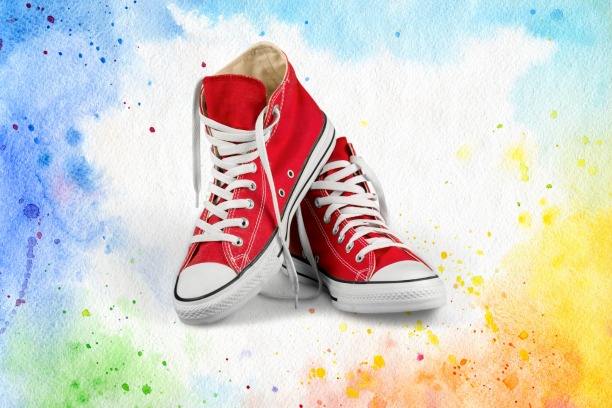
Product photography isn’t as easy as people make it out to be. In fact, this style of photography requires a lot of thinking and preparation even before the actual shooting begins. One of the most important parts of product photography is choosing the right background color.
Choosing a background color that works in product photography is very important for a number of reasons. The right color can really make your product pop which in turn can attract buyers more often. There are other reasons which we will get into later on.
If you are looking to choose a background color for product photography, there are some things you need to consider. From keeping a consistent color scheme to remembering your brand identity these are just a few things you need to consider.
Our article will go in depth with these and other points to ensure that you are able to choose the right background color during your product photo shoot. We might not be thinking that you are way over your head but no worries. Our guide will simplify the concept to make your products shine wherever you share them.
Why Choosing a Background Color for Product Photography So Important?

Aside from just making your product photos look more attractive there are other reasons why you need to choose the right background color. Here are some common reasons why it’s important:
1. Highlighting Your Product
When you choose a background color for product photography that works you draw attention to it more. This is the key feature that will help you get more buyers for your products. Right background colors highlight your product’s features and attributes more naturally.
2. Creating Brand Consistency
Consistency is vital for brand establishment. You can build a unique style to strengthen your brand identity with the right background colors. Staying with that background color will make it convenient for potential buyers to recognize your brand across multiple channels.
3. Setting the Mood
Colors can do a lot of interesting things like setting a mood and tone for your product. Different colors are known to evoke different moods even in product photography. When you choose a background color for product photography and that color evokes the right emotion, your target audience might be more likely to respond to your message.
4. Enhancing Product Presentation
The right background color can have a strong influence on how potential customers see your product. The cleaner your product photos look with the right background color the more enticing it will look to your customers. And the opposite is very much true as well.
5. Optimizing for Different Platforms
Nowadays, sharing your product photos across multiple platforms, such as websites, online stores, and social media, is very common. A background color that is versatile and adaptable is important because it will cut down on the time needed to share them. This is because the right color can stay consistent and impactful throughout all the platforms.
How to Choose a Background Color for Product Photography?

Now that you know why it’s important, we will review how to choose a background color for product photography. Our guide will simplify the process so that you can pick a background color that works for your products more easily and more effectively. So here is how you do it:
Product Color Scheme
Before doing anything else you need to consider the color scheme of your product. When you choose a background color for product photography, knowing which color complements or contrasts your product is essential. It would be best if you went with a lighter-colored background for dark-colored products to make them pop more. A more neutral background is better for products with bright colors since it won’t distract from the product.
Here are some effective tips for product photography from professionals that are sure to give you excellent results every time.
Color Psychology
With a clear idea about your product’s color scheme you can now move onto color psychology. This step will help you with making a decision on which background color is best for your product. As we said before, different colors evoke different emotions. A simple example would be warm colors like red and orange, which bring excitement and urgency. Another example would be cool colors like blue and green that evoke calmness and tranquility. You must select a background color to set the right mood and message and align with your product.
Branding
When you choose a background color for product photography you must keep in mind your brand’s identity. The background color should reflect personality, values, and aesthetic of your brand. An easy way to do so is to pick a color that matches or comes close to your brand’s primary colors. Picking a brand color will help you to stay consistent and make it easier for buyers to more easily recognize your products and brand.
Usage and Medium
As we mentioned, nowadays, product photos are now shared on multiple platforms at the same time. Many of these platforms have their own requirements regarding photo size, colors, etc. For example, Amazon requires a pure white background for product images. Etsy and eBay don’t have such strict requirements but insist on lighter-colored backgrounds. So, when you choose a background color for product photography, you must remember these requirements. Our recommendation would be for you to pick a background color that’s versatile so that it works on multiple platforms.
Learn how to optimize product photos for SEO to guarantee finding your target audience and rank in search engines.
Color Contrast
Using color contrast when choosing a background for product photography can be very advantageous. Contrasting colors let your product pop more and get the viewer’s attention. For example, with a dark-colored product, you should add a light background, allowing the viewer to see your product in more detail. But remember you shouldn’t go overboard because contrasting colors are very fickle. Go too far and you will make your product photos look unnatural. Look for a middle ground where there is contrast and cohesion as well. You can also contrast logos, text, and overlays not just the background. So experiment and find what works best for your product.
Gradients and Patterns
Solid backdrop is just one method. Try gradients and patterns in your background for different results. A gradient with two complimentary colors in the background can bring so much needed depth and dimension. Also you can use patterns like geometric shapes or muted textures in your background. The color can stay white or neutral but the texture will make the product look amazing but not distracting. If you use gradients and patterns ensure that it only compliments the product and does not compete with it.
Color Consistency
Lastly, you must ensure that your background color is accurate and consistent. During your product photoshoot you need to keep an eye out for any shifts or discrepancies. Things like lighting conditions, camera settings, and editing techniques can and do affect color accuracy. Make changes regularly while you take photos to ensure color consistency and accuracy.
Outsource Background Color Changing
Sometimes, you can’t choose a background color for product photography; therefore, you should outsource it to professionals. Professional eCommerce photo editors can easily pick the best background color and give you high-quality and consistent results. They can also save you time and meet all your demands with ease.
Look for a photo editing agency with a good reputation and solid track record of editing product photos. Clipping Path Finder (CPF), with their years of experience, can be the right one for you. They offer a wide range of post-production and product photo editing services that are affordable and effective.
Read More: How To Photograph Jewelry: Jewelry Photography Tips (2024)
Conclusion
With that you now know how to choose a background color in product photography that will ensure your product looks amazing. Our guide in choosing the best color for your product is basically a blueprint. You need to experiment with colors and techniques to find what works best for your product.
The more you experiment the more you will learn about your product and what can help you out the most. Be creative, experiment with everything, and most importantly have fun! Product photography is an art just as much as its science.
Hopefully, you can make your product shine and attract a target audience with a killer background.